Advertising and promotion!
For my advert I went through a variety of ideas, using a real wine bottle and ink to create a funky looking bottle of wine, different people and poses holding a wine bottle and many others and none seemed to quite fit to my style of packaging. So, I decided to go with what I know best which is the night sky. I went on photoshop and created what looks like a blast of different colours in the night sky, forming something similar to a nebula. I added speckles across to look like stars, much like I did with my packaging. I originally did all this with just different brush tools and a few different colours and then to make it stand out a little more I played around with the brightness and contrast. After that I changed the hue and saturation which gave me completely different colours and enabled me to match them to the different packaging. So the outcome was a different ad for each bottle of wine/different packaging. Once the background was down I just put in a blank black background to make it look like the night sky. Then the next step was typography.


I moved my background into illustratWhen doing the text I'd written a few ideas of slightly cheesy but sky related slogans. I came up with things like 'taste thats out of this world', 'a taste so strong it will make you see stars' and then 'Journey into outer space'. I quickly wrote out the text just to see what it looked like and decided that it suited the page. I went onto 'dafont' and looked at different texts but none really made me think that looked the best. This led me to just using a bog standard font on illustrator - Helvetica Neue, Condensed Black. I then changed the hight and length of the words so it would look similar to my Nyx logo (which is quite a tall text).


Finally I rearranged the text to how I wanted and changed the portrait final outcome to landscape (so I had both for any ads I wanted to place it in). Although its simple and in my opinion doesn't look the most professional I believe it fits well to my product as a wine based on the sky isn't the most sophisticated really, is it?
The image I used was from a series of photos I took of ink dropped into a wine bottle to create my drink. I originally actually did this by accident, I was simply adding the ink so the wine didn't look like water and had a little colour to it. But, upon seeing the slow drop it made and how amazing it looked I quickly scrapped that and had a mini photo shoot. I took a few photos with a white background and some with other backgrounds, and changed up the colour (often adding more than one to create different textures and colours).


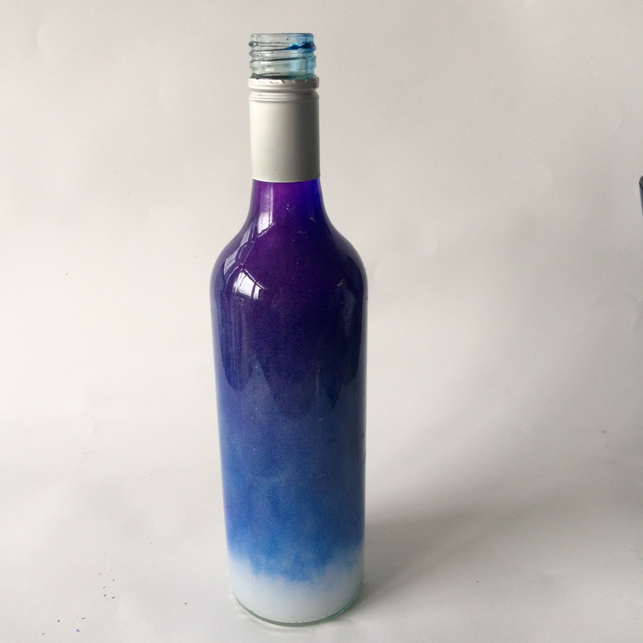

Because I didn't want to miss the ink dropping This photo accidentally got my hand in as I was pouring and I found I liked this as well. A lot of accidents happened during this process but none of them bad! I'd say the experimentations were a huge success as it gave me a lot of ideas for my ad and a lot of material to work with. Here I changed up the background from white to a wooden background with a picture of a bar in the background It's hard to see as I placed it behind a frame as I didn't want it to be to bright - I was just trying different things to see how it looked, although it isn't the strongest background the photo of the wine and ink itself I think makes up for it. In the end I got rid of all backgrounds anyway to go against the one I created on photoshop.

This is the wine bottle I ended up using in the end as the hand and bottle placement and drop of the ink just looked the best to me. I cropped out the rest of the background for my ad and enhanced and changed up the colouring as I went.

Here are my finals ads.
 |
| For Rose wine. |
 |
| For White wine. |
 |
| For Red wine. |
Finally! I placed the ads that I'd designed onto some images I'd taken when out and about. This was taken during our London trip, and I just replaced the posters already there with my own ad for Nyx, placing all three on the image. I think they work well together but they also work well without one another and don't need the other ad for it to make sense.
 |
| (The original) |

This photo was also taken in London, unfortunately it was taken on the trip back home when it was sufficiently dark. Nevertheless I placed my ads on the billboards to get the overall look. I think they really stand out against the darkness and it's kind of suitable for my product anyway.
 |
| (The original) |

No comments:
Post a Comment